Organise Festival Map Information by Visitor Task
Organise festival map information by visitor task so people can locate stages, toilets and routes quickly, without making essential details compete with optional stops.
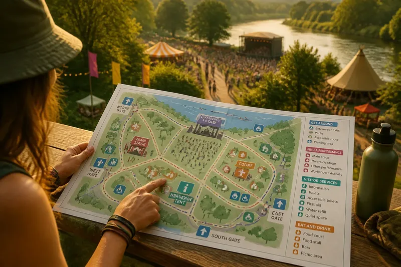
Organise festival map information by visitor task, and people can find a stage, toilet or route without sorting through unrelated details. A map becomes harder to use when performer biographies, food descriptions and access notes compete with the symbols someone needs to follow.
The aim is not to make the map sparse. Give each kind of information a clear place, so readers can scan for a task and then use its details.
Reader tasks
Before adding symbols or labels, list the tasks a visitor might bring to the map: entering the site, finding a performance, locating a toilet, meeting someone, buying food or checking a route. Each task suggests a useful group.
Some details serve more than one purpose. A first-aid point is a service location, but someone seeking help also needs to recognise it quickly. Keep it in the services group and give it a distinctive symbol rather than duplicating it across the map.
Try plain-language group names such as “Get around”, “Find a performance” and “Eat and drink”. If a detail fits none of them, consider whether it belongs on the map, in the programme or in a separate information panel.
Essential locations
Entrances, exits, information points, toilets and first aid usually belong in a core wayfinding group. Food stalls, craft tables and informal meeting spots can sit in separate groups, even when they are close to those essentials.
Separation should not make secondary places hard to find. It should prevent every symbol from having equal visual weight: someone checking the route from the entrance to a stage should be able to notice the route and key services before optional stops.
Cover the labels and inspect the symbols alone. If essential locations do not stand out, revise the grouping or visual hierarchy.
Visual cues
Use a consistent set of cues to distinguish groups. Colour can help, but pair it with a symbol, a short label or both. A fork-and-cup icon labelled “Food and drink” is clearer than a coloured patch whose meaning must be guessed.
Choose cues that remain legible in greyscale and on a phone with limited brightness. Avoid similar colours for neighbouring groups, and use the same cue for the same information on the map and in its legend.
Ask someone unfamiliar with the design what each symbol means before you explain it. An unexpected interpretation is a reason to change the cue.
Legend and labels
A legend should explain symbols, not become a second directory. Align its groups with visitor tasks, match the wording on the map and order entries so the most useful categories are easy to locate. An alphabetised list can force readers to search through unrelated items.
When a place name matters, put it on the map where it can be read at a glance. Let the legend explain the symbol or category, and avoid repeating every label in both places unless the duplication solves a clear reading problem.
Say you are laying out a map with a riverside stage, a food court, toilets and an information tent. Put performances, visitor services and food in separate groups; someone looking for the toilets can scan the service symbols rather than search a mixed list. The expected result is a more direct visual search, though visitors will not all read the map in the same way.
Routes and access
Location symbols answer “Where is it?” Routes answer “How do I get there?” Give paths, gates and directional arrows a distinct treatment, and keep route lines from obscuring labels or symbols.
If a site has several entrances, label them and show which paths connect to each. State meaningful restrictions or access features plainly in the map key or accompanying information rather than relying on colour or line style alone.
Confirm route details with the people responsible for the site. Do not show a path as open if the layout or event arrangements may close it, and keep the map consistent with current on-site signs.
Group access details so visitors can find them without decoding a dense layer of symbols. Use clear wording for features such as step-free routes, accessible toilets, quiet spaces or viewing areas where these are provided.
A symbol cannot capture every person’s access requirements. The map can identify facilities and describe route features, while a short note points to fuller information where details need explanation. Match the wording to the event’s actual arrangements; where local requirements or venue guidance matter, check with the responsible venue or a qualified access professional.
What should festival map information show?
How many categories should a festival map use?
Use as few categories as needed to make each visitor task easy to recognise. Divide a group if it contains unrelated locations; combine groups if they hold only a few similar items each.
Should every stall or activity appear on the map?
Show individual locations when visitors need to find a specific destination. If small points of interest crowd the map, show a named cluster and provide a separate directory for stall-by-stall details.
How can a festival map work on a phone?
Keep labels concise, maintain readable contrast and do not rely on tiny text to explain symbols. If the digital map can be zoomed, retain a useful overview and make the legend easy to reach.
What should change when the site layout changes?
Update affected locations, routes, labels and legend together, then check that the programme and on-site signs still agree. A changed entrance or path can affect how visitors interpret several groups.
Map checks
A map can look orderly at a desk and still be difficult to scan at a busy entrance. Print a draft at the size visitors will use, or view it on a phone, and ask someone unfamiliar with the site to find a few destinations without coaching.
- Check whether the main entrance is easy to identify; if it is, keep its symbol and label, but if it is not, make them more prominent.
- Check whether the information point stands out from optional stops; if it does, retain its place in the services group, but if it does not, revise the symbol or grouping.
- Check whether route lines look different from location symbols; if they do, keep the distinction, but if they do not, change the line style or symbol treatment.
- Check whether a named performance space can be found without reading every category; if it can, preserve the label placement, but if it cannot, move the label or clarify the performance group.
- Check whether toilets and other services sit in one clear group; if they do, retain that grouping, but if they do not, regroup the symbols under a plain heading.
- Check whether labels are legible at the intended print or screen view; if they are, keep their size and wording, but if they are not, shorten the text or give it more space.
- Check whether the legend uses the same names and symbols as the map; if it does, keep the pairing, but if it does not, align the wording and cues.
- Check whether access information can be understood without colour alone; if it can, retain the paired cues, but if it cannot, add a clear label or symbol.
Use hesitation to locate where the hierarchy breaks down. A confusing symbol calls for a clearer cue; an overloaded area may need a separate directory; a hard-to-read label may need more space or shorter wording.
Keep festival map information tied to the tasks visitors bring to the site, and reserve extra detail for places where readers can seek it without losing the route, service or destination they need. When the map is nearly ready, hand it to someone new and let their first search show which group or cue still needs work.